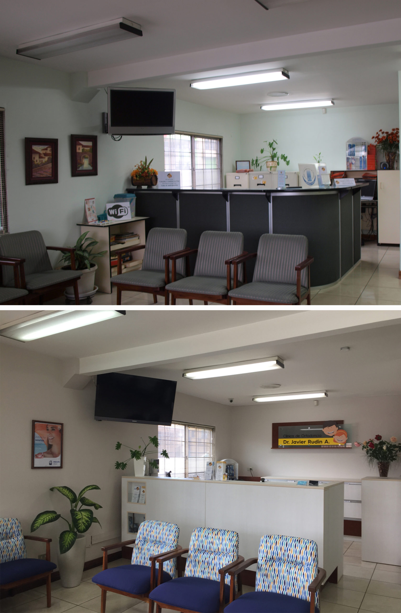
Dr Rudin’s Orthodontics Clinic needed a makeover.
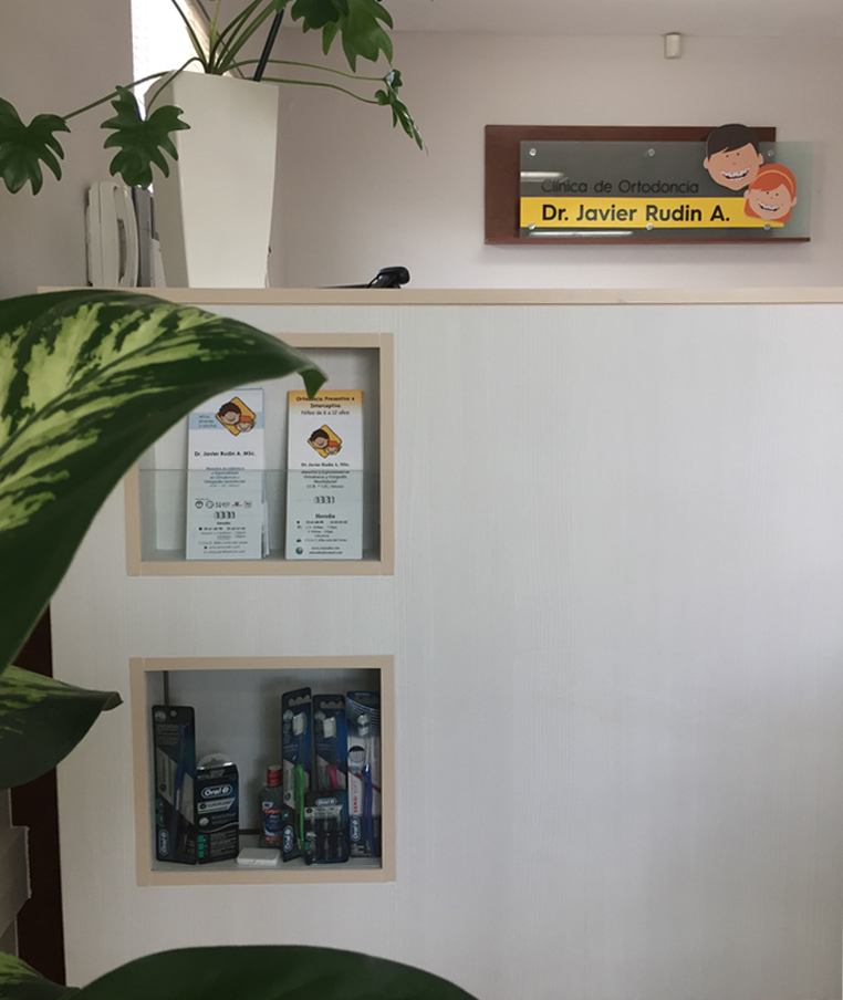
The reception space was a little lost in the past, and it didn’t solve all the day to day needs. In collaboration with Rudin Digital Design, we created an image strategy: everything would be refreshed, from graphic design to interior design.
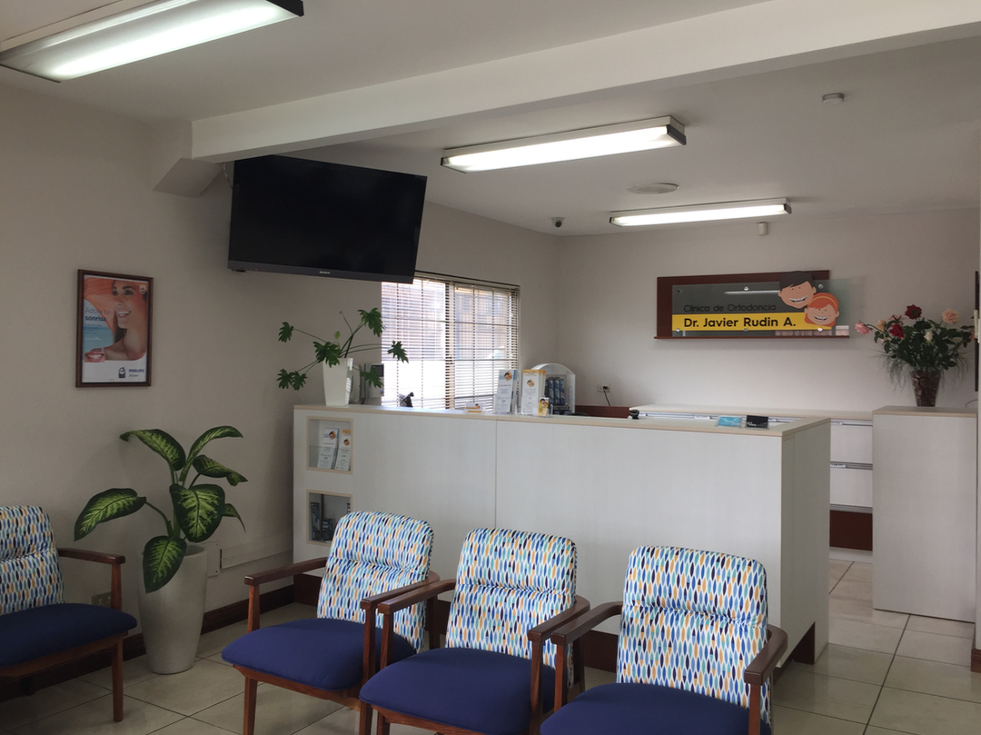
The new design finally measured up to the service offered by the Clinic: a fresher, cleaner and more modern image. The intervention included:
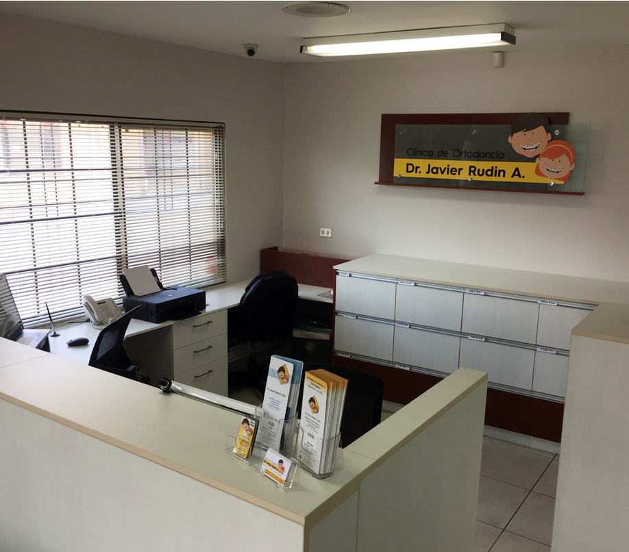
- Custom design of new reception furniture
- Color palette
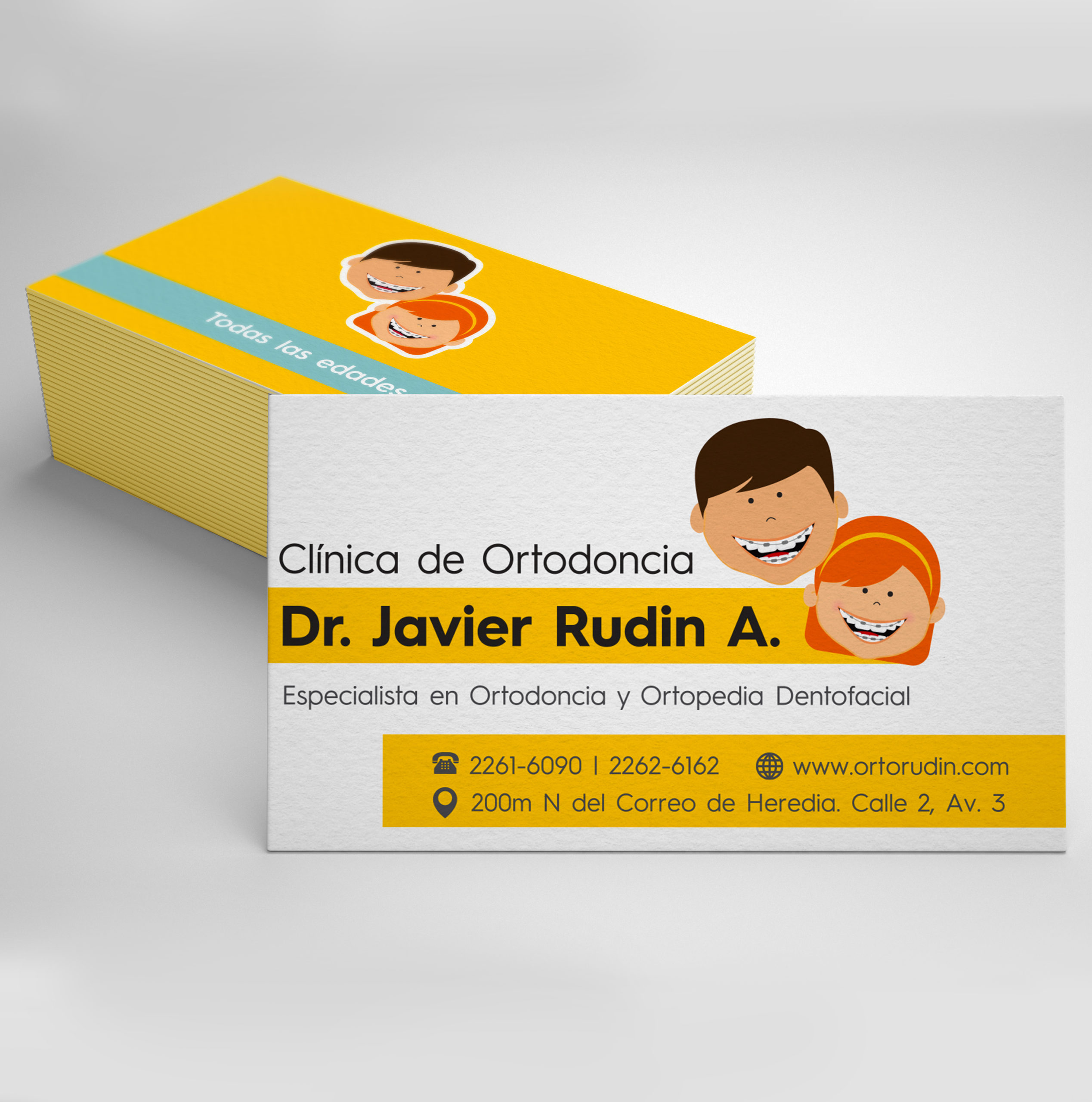
- Logo design
- Complementary graphic design: business cards, brochures, informational signs


